Why Does Every Romance Book Cover Look the Same?
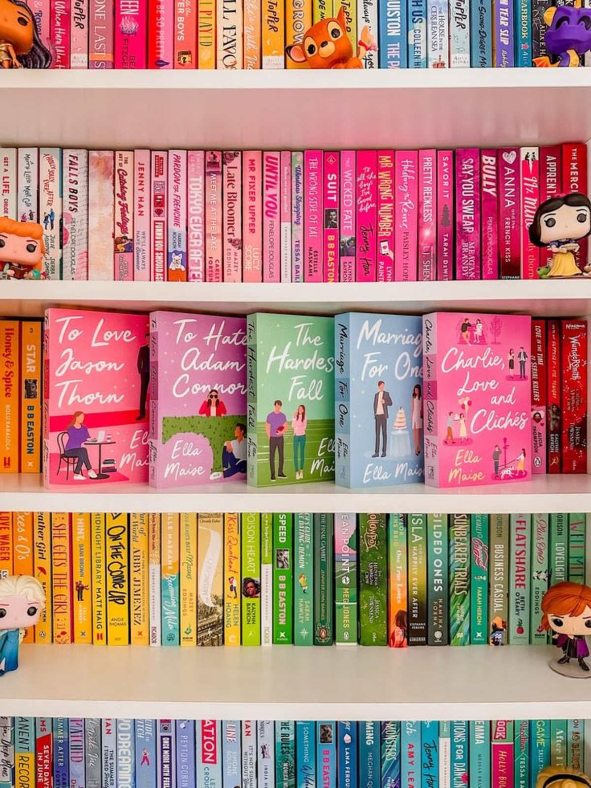
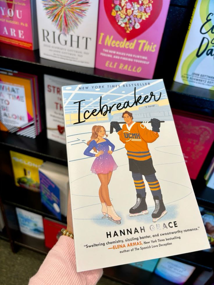
Nowadays, it seems like everywhere you look in a bookshop, there is a sea of illustrated romance covers. Most will look at the covers and think, “Oh, yeah! I love that writer!” when they look at one, purely because of the style of the cover, only to discover that the book is by a completely different writer, indistinguishable from the cover. It's almost always the same two cartoon characters in some cheesy pose, wearing the same basic clothing every time. Sometimes they are holding a coffee cup. Sometimes one of them is holding a hockey stick. Sometimes they are standing in front of a city skyline. And somehow, after looking at enough of them, you start to feel like you've already read the book before you've even opened it. If you've set foot in literally any bookstore in the past few years, you probably know exactly what I mean. There is always that one table near the front that feels like the physical version of “BookTok made me buy it.” It is stacked with romance novels that went viral online, and you can usually spot them from ten feet away because they all have the same bright, candy-coloured look. Bold lettering, cute illustrations, two people who are obviously going to fall in love, and usually some little object that is supposed to tell us something about the story. And I know we are all told not to judge a book by its cover, but come on. The entire purpose of a book cover is to make us look at it and judge it. We are not exactly failing a moral test here. A book cover is one of the first things that tells us what kind of story we are about to read. It can tell us the genre, the mood, the audience and even the kind of reading experience we should expect. Colour, typography, composition and imagery all play a part in this. Bright pinks, yellows and oranges can make something feel happy and playful, while darker colours can immediately make a book feel more serious or mysterious. Even fonts have personalities. A traditional serif font can feel more classic or literary, while a clean sans-serif font can make something feel modern. The placement of the title and author's name can change what catches your eye first. Some authors even have their names displayed so prominently that the name itself becomes part of the branding. And honestly, I find that fascinating because it means that a cover isn't just a pretty picture slapped onto a book at the last minute. There is a lot more thought behind it.
My Opinions
This isn't me dissing these covers by any means. Sometimes, I think an illustrated cover definitely fits a certain type of book, like a rom-com such as Better Than the Movies. In my mind, Lynn Painter's novels are synonymous with this type of cover because it just seems to be the right sort of vibe to match the book itself. It just gives that sort of cute, lovey-dovey feeling. And I actually like that. There is something about a bright illustrated romance cover that makes me want to pick it up and see what is inside. Maybe it's the colours. Maybe it's the little details. Maybe it's just because my brain sees a cute cover and immediately assumes I am about to have a fun time. In my opinion, these covers are much better than old romance novel covers, which were often just stock images of a shirtless man with his face cut off. Illustrated covers allow artists to do the work and make money, whilst also appealing to more readers. I completely understand why someone would rather carry a cute illustrated book around than a book with a man's entire chest taking up the front cover. I would probably feel the same way. There is something much less intimidating about a cartoon couple standing next to each other than a man who looks like he has never seen a shirt in his life. And that was actually one of the reasons illustrated covers became so successful. Publishers realised that there were readers who loved romance but didn't necessarily want the outside of their book announcing exactly what they were reading. A cartoon cover made romance feel more approachable and less embarrassing to carry around. The bright colours also work incredibly well online because books are constantly being seen as tiny thumbnails on Amazon, Goodreads, Instagram and TikTok. A bright cover with a huge title is much easier to recognise when it is the size of a postage stamp on your phone. There are also practical reasons for illustration. It can be less expensive and complicated than organising a full photoshoot, and it allows the characters to be less visually specific, meaning readers have more room to imagine them for themselves. Helen Hoang's The Kiss Quotient is an interesting example of this. Hoang has spoken about wanting an illustrated cover partly because she wanted to avoid unconscious bias and tell a love story involving an Asian character without race becoming the first and only thing a reader noticed. I actually think that's a really interesting reason to use illustration. It reminds me that there is a lot more behind this trend than publishers simply deciding that cartoons are cute.

So Why Do They All Look the Same?
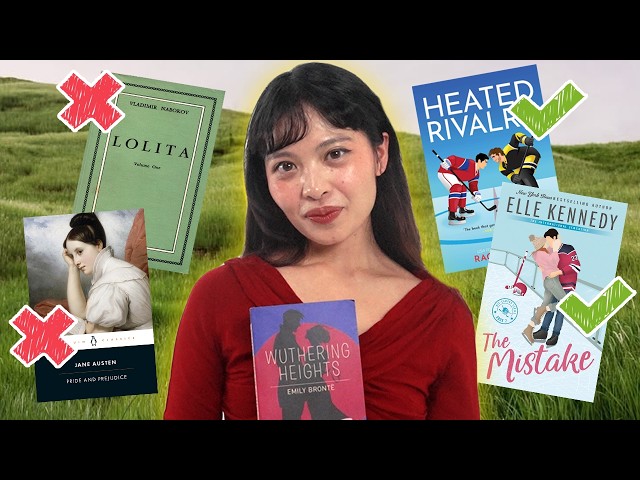
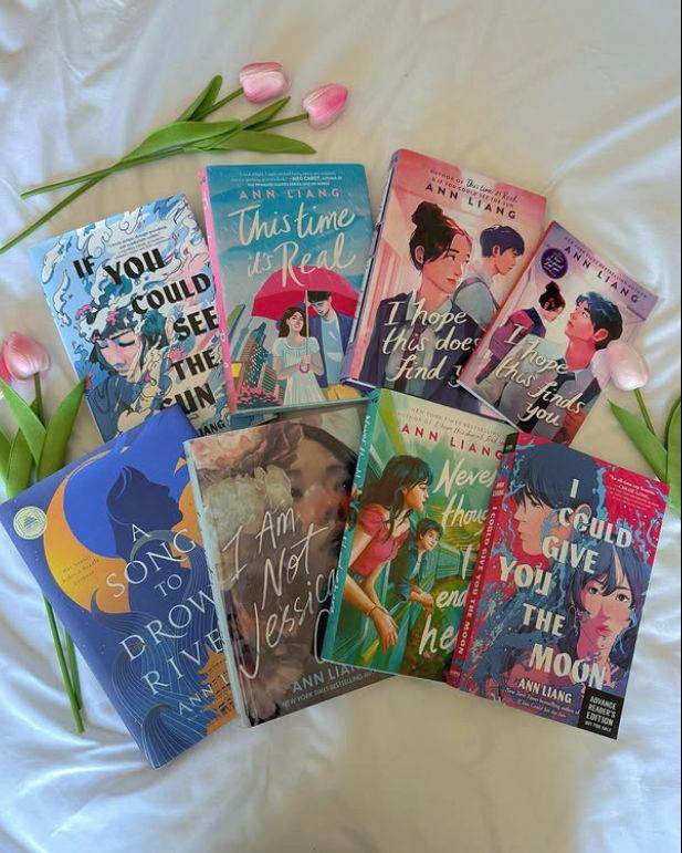
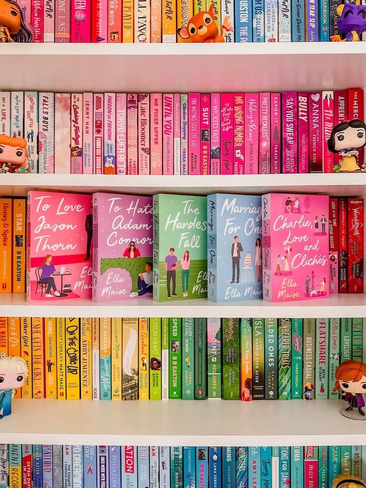
This is where my problem begins. Because there is a difference between having a recognisable style and having no individuality at all. When a style first becomes popular, it is usually because it works. One book does well, readers respond to it, other publishers notice, and suddenly you start seeing similar designs everywhere. That's just how trends work. But eventually, everybody is doing the same thing. And once everybody is doing the same thing, the whole point of standing out disappears. This is what I feel has happened with romance covers. You can change the hair colour. Change the clothes. Put one character in a lab coat instead of a football uniform. Give them a coffee cup instead of a suitcase. Change the background from New York to a beach. But underneath all of that, the formula is still the same. Two illustrated people. Bright colours. Large title. Cute pose. And there are times when I genuinely pick up a book and think, “Wait, haven't I already seen this?” The funny thing is that publishers actually want covers to stand out. Designers are trying to make a book noticeable amongst thousands of other books sitting beside it in a bookstore or appearing on a screen. But if every publisher is using the same visual language, standing out becomes incredibly difficult. It's almost like everyone is trying to be different in exactly the same way.
The Stories Aren't Special Anymore
Now, I know that everybody always finds these books so predictable: “They don't like each other, but along the way they're going to fall in love,” and most often, they're right. Yes, the stories are predictable. But then again, so is a movie like When Harry Met Sally or 27 Dresses. As a society, we find comfort in these simple stories that we already know. The real story that we read for is the small details: the dates that are definitely just “casual hangouts as friends” or the frustrated “I hate you” when we all know they don't. It's the little things. The way one character remembers something tiny about the other. The late-night conversations. The accidental hand touches. The moment they realise that maybe their friendship isn't just friendship anymore. Those are the things that make a predictable romance feel special. And this is why I don't necessarily mind a predictable trope. I actually love knowing that two people are probably going to fall in love. That's why I'm reading the book. What I don't want is for the cover to make me feel like I've already seen the entire story. These new covers can sometimes force our perception before we've even read the first page. The cover promises a certain kind of book. It promises cute. It promises funny. It promises light-hearted. It promises a particular kind of romance. And if the actual story doesn't follow that feeling, the reader can end up disappointed even when the book itself is perfectly good.
When the Cover Misleads You
This is one of the biggest things that bothers me about the trend. Imagine picking up a book with a bright pink cartoon couple on the cover. You immediately assume it is going to be a fluffy rom-com. Maybe enemies to lovers. Maybe fake dating. Maybe some ridiculous misunderstanding that could have been solved with one conversation. Then you open it and realise the book is much heavier, more emotional or more mature than the cover suggested. That's where I think things get complicated. How to End a Love Story by Yulin Kuang is a good example of the conversation around this. The cover makes it easy to assume you're getting a typical illustrated rom-com, but the book itself deals with much heavier emotional material. Kuang has discussed the disconnect between the cover's presentation and the actual story, which shows how a cover can create expectations that the author never intended. And that is what I mean when I say that covers can sometimes become misleading. I'm not saying that every book has to have a dark, serious cover just because the story is emotional. Obviously not. But there should be some connection between the outside and the inside. A book cover should make me curious about the story, not make me expect an entirely different story. One question from designer John Gall has always stuck with me: could this be the cover for another book? Because if the answer is yes, then maybe the cover isn't specific enough. And I think that's exactly the problem with some of these illustrated romance covers. They tell me that it is a romance. Great. But they don't always tell me what makes this romance different from the hundred other romances beside it.
The Publishing Side of the Story
The more I looked into book covers, the more I realised that we probably blame the wrong people sometimes. As readers, we see the final cover and assume that the author chose it, the designer drew it, and that was the end of the story. Apparently, it is much more complicated than that. In traditional publishing, a cover can pass through an entire chain of people. The designer creates concepts. There are cover meetings. Editors and publishers discuss them. Marketing and sales teams give their opinions. Sometimes the author sees the designs and gives feedback. Sometimes the cover goes through even more rounds of changes. Retailers can have opinions about what they think will work in their market too. And I honestly feel bad for designers sometimes because imagine creating a cover you genuinely love and then having six different people tell you to change it because it needs to “sell better.” At the end of the day, book design is art, but it is also a business. A designer might think something is beautiful. The author might think it perfectly represents the story. The marketing team might think nobody will buy it. The sales team might think it doesn't look enough like the books currently selling. And somehow everyone has to come to an agreement. So when we look at a cover and think, “Why did they do that?”, there is usually a reason. We just might not agree with the reason.
Do Authors Get to Choose Their Covers?
This is something I find really interesting as a writer myself. If you are traditionally published, you don't necessarily get complete control over your cover. How much input an author has can depend on their publishing house, contract and the specific project. Some authors are closely involved. Some have more limited input. And honestly, I can understand both sides. As an author, you have lived with these characters for months or years. You know what their bedroom looks like. You know exactly what colour their eyes are. You know what they would wear on a random Tuesday. You know the scene that inspired the entire book. So obviously you are going to have a very specific idea of what the cover should look like. But a designer is looking at the book from a completely different perspective. You know your book. They know how your book has to sit on a shelf next to hundreds of other books. And that is a huge difference. Independent publishing gives authors much more control, but it also means the author is often responsible for finding the designer, understanding the market and making those decisions themselves. So there isn't really one perfect system.
Different Countries Can Have Completely Different Covers
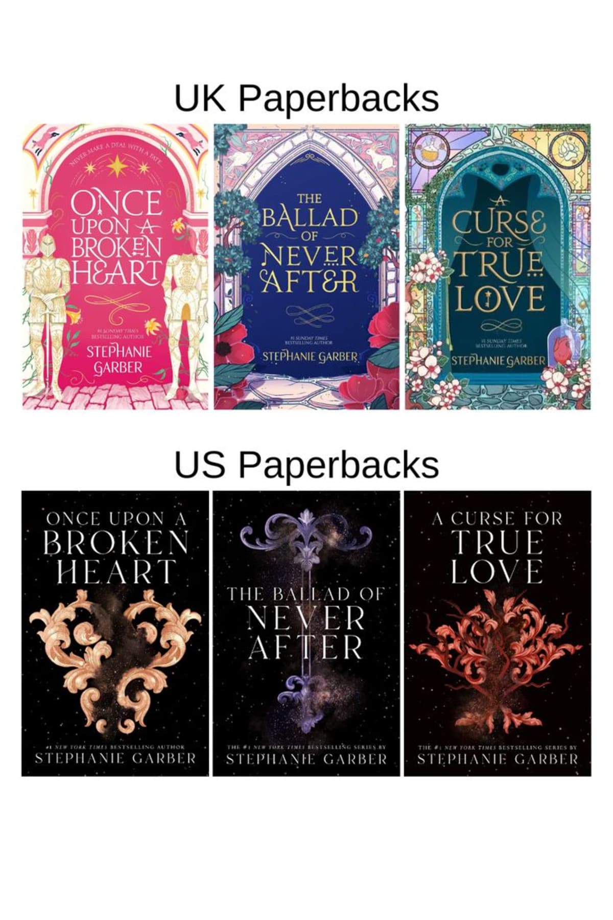
Another thing I didn't think about much before researching this is how different book covers can be between countries. A publisher might release one cover in the United States and a completely different one in the United Kingdom. Sometimes the title even changes. Harry Potter and the Sorcerer's Stone became Harry Potter and the Philosopher's Stone in the UK. People We Meet on Vacation was published as You and Me on Vacation in the UK. And the reason is pretty simple. Different markets have different readers. Something that looks appealing in one country might not have the same effect somewhere else. Cultural expectations, colour associations, typography and genre conventions can all affect what publishers choose. This is another reason why I don't think there is one universal definition of a “good” book cover. What works for one reader might look completely wrong to another.
Romance Has Always Had Cover Trends
The funny thing is that the cartoon romance cover isn't actually the first time romance has been accused of looking ridiculous. Romance covers have always gone through trends. In the 1970s and 1980s, we had the famous bodice-ripper era. These books often had incredibly dramatic stories and equally dramatic covers, with muscular men, women in flowing dresses and a lot of very intense embracing. Then there was Fabio. Fabio Lanzoni became one of the most recognisable romance cover models of the 1980s and 1990s. He appeared on an enormous number of covers and became so associated with romance that his image almost became a genre shorthand. If you saw a long-haired, shirtless man dramatically holding a woman, you didn't need to read the title. You already knew. And these covers were controversial too. Some readers loved them. Some writers hated them. Some booksellers refused to stock certain covers because they were considered too explicit. So apparently, romance readers have been arguing about their covers for decades. We just have better internet access now, so we can argue about them on BookTok.
From Fabio to Emily Henry
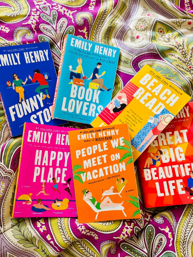
The shift from those hyper-realistic romance covers to the illustrated covers we have now didn't happen overnight. Romance covers became more photographic throughout the 1990s and 2000s, and then other trends started appearing. Twilight popularised minimalist symbolic covers for a whole generation. Fifty Shades of Grey used objects and dark, sophisticated-looking imagery. Then illustrated romance began to take over. Books such as The Hating Game, The Kiss Quotient and later the hugely successful books of Emily Henry helped make the style increasingly recognisable. Emily Henry in particular has created a very strong visual identity. Her books have bright colours, bold typography and illustrations that often don't show the characters' faces too clearly. You can put several of her books together and immediately know they belong to the same author. And from a branding perspective, that's brilliant. But then everyone started doing it. And now we're here.
Why People Actually Like Them
I think it's important to say that people genuinely do like these covers. Not everyone who buys them is being tricked by marketing. Some readers simply like the aesthetic. They are colourful. They are cheerful. They look good on shelves. They feel approachable. They make romance seem fun rather than embarrassing. And I can absolutely understand that. I actually love when a cover matches the personality of the book. If I'm picking up a fluffy rom-com and the cover is bright and adorable, I want that. I want the cover to make me feel the same way the story does. The problem isn't that illustrated covers exist. The problem is when illustration becomes a requirement rather than a choice.
The “Too Young” Problem
However, I do disagree when you pick up a book by Emily Henry which has the same style of cover as a light-hearted, clean book. Certain authors are known for the level of “spice” in their books, and Emily Henry is one of these. My worry is that illustrated covers tend to infantilize the novel and market it more to younger audiences when it's not appropriate for that age range. And this is where BookTok makes things even more complicated. A lot of teenagers are discovering adult romance through TikTok. Some of these books have mature sexual content, but their covers can look incredibly youthful. The cover might look like something a thirteen-year-old would happily pick up. But the book inside might absolutely not be for a thirteen-year-old. I'm not saying teenagers don't know what they are reading. I'm also not saying parents should control every single book their child reads. And I'm definitely not saying that every illustrated romance cover is secretly inappropriate. But I do think the visual marketing of a book matters. When YA, New Adult and Adult romance all start appearing in similar visual packaging, it becomes harder for someone unfamiliar with the publishing world to understand the difference. And sometimes I think publishers need to remember that a cute cover doesn't automatically mean a cute book.
The Other Side of This Argument
At the same time, I don't think it's fair to put all the responsibility on publishers. Parents have responsibility too. Readers have responsibility. Bookstores have responsibility. And publishers are also trying to sell books. It's a complicated problem. If we start putting huge content labels on every adult romance book, some people will argue that it becomes stigmatising. Others might say that it helps readers make informed decisions. Then we get into the much bigger question of who decides what is mature enough, and that becomes complicated very quickly. I don't think there is an easy answer. I just think the conversation is worth having.
Do You Judge a Book by Its Cover?
Obviously. Most of us do. Even if we don't want to admit it. If you put two editions of the same book in front of me, and one is gorgeous and the other looks like someone made it in Microsoft Word five minutes before the printing deadline, I know which one I'm picking. And I think that's completely normal. Book covers are visual art. They can make us excited about a story. They can make us imagine characters before we meet them. They can even change how we experience the book. I remember when I was younger, there were books I picked up purely because I liked the people on the cover. I could almost imagine the book as a movie because I already had a visual in my head. But there is a downside to that too. Once a cover gives you a very specific image of a character, it's difficult to change it. If you read The Raven Boys and create your own image of Ronan Lynch in your head, and then someone tells you their dream fan cast, you might suddenly feel personally offended. I have an unwavering idea of what Ronan Lynch looks like in my head, and I will not be taking outside suggestions. Thank you.
The Weird Thing About Covers Is That They Age
One thing I find really interesting is how quickly our opinions about covers change. There are covers that people considered beautiful twenty years ago that now look incredibly dated. And there are covers that look effortlessly chic today that will probably make people laugh in another twenty years. The Twilight apple is a perfect example. Once upon a time, that cover was iconic. Now, depending on who you ask, it is either nostalgic or slightly ridiculous. And that's completely normal. Design trends change. Fashion changes. Fonts change. Colours change. What looks expensive changes. What looks modern changes. What looks romantic changes. So maybe in ten years we'll look back at the era of cartoon romance covers and laugh. Maybe someone will pick up People We Meet on Vacation and say, “Oh my God, remember when every romance book looked like this?” And honestly, I think that would be kind of fun.
What About AI?
And now there is another change coming into the world of book covers: AI-generated artwork. This is something I feel much more strongly about because there are actual artists behind so many of the illustrations we see. Illustrators spend years learning how to draw, compose images, understand colour and create a visual style. So when AI-generated artwork enters publishing, there are obvious questions about artists' jobs, consent, training data and whether human creativity is being valued. I'm not against technology changing art. Art has always changed with technology. But I don't think we should reach a point where publishers see human artists as unnecessary simply because an AI tool can create something quickly. If anything, I would rather see publishers use technology to help artists than replace them. Because one of the reasons I like beautiful book covers in the first place is because there is a human being behind them.
And Then There Are Special Editions
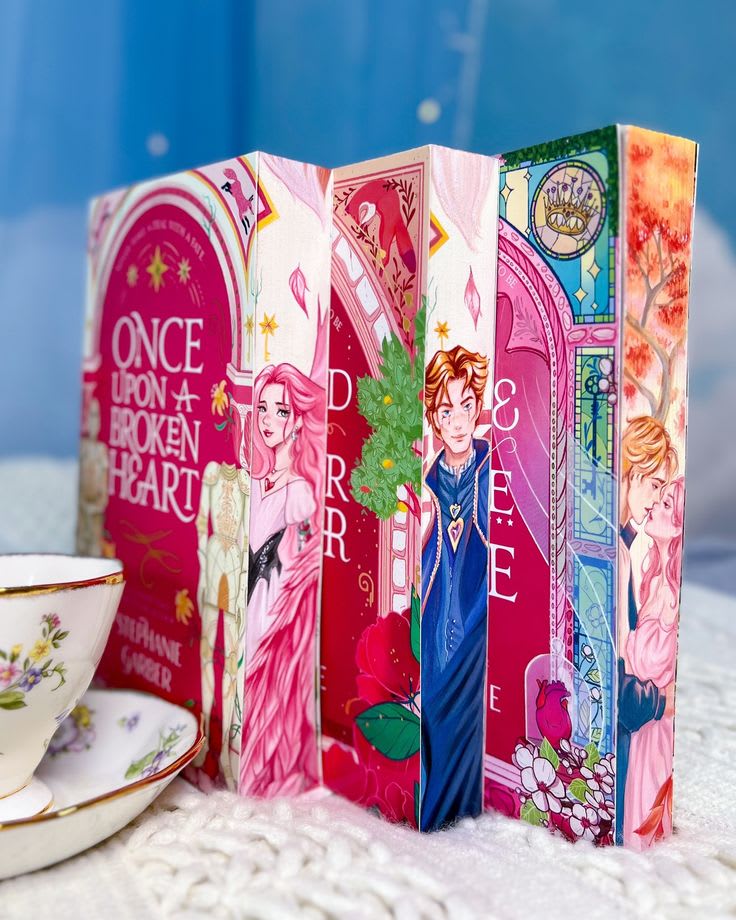
This is another rabbit hole entirely. Sprayed edges. Foil. Ribbons. Beautiful endpapers. Exclusive illustrations. Fancy dust jackets. I love them. Do I need them? Absolutely not. Will I still stare at a beautiful special edition online for twenty minutes? Absolutely. But I do think we've reached a point where reading and collecting books can become two completely different hobbies. Sometimes people are buying books because they want to read them. Sometimes they're buying them because they want them to look pretty on their shelf. And honestly, I don't think there is anything wrong with either one. Books can be stories and objects at the same time. But it is interesting how much social media has changed the way we think about them. A book isn't just something we read anymore. It is something we photograph. Something we display. Something we match to our room. Something we put in a TikTok. Something we use to create an aesthetic. And suddenly, the cover matters more than it ever did.
So Will Cartoon Covers Ever Go Away?
I just have to believe that the illustrated cartoon covers will fall out of trend at some point. Not because of my own personal bias, but because they've dominated the market for several years now, and it's only a matter of time before we get bored, as we do with all trends. We've already seen it happen. The clinch covers came and went. The single-object covers became a huge thing. Minimalism came and went. Photographic romance covers changed. And now cartoon covers are everywhere. Eventually, another style will take over. Maybe it will be abstract. Maybe we'll go back to photographs. Maybe we'll get detailed paintings again. Maybe everyone will suddenly decide that books should have nothing but typography on the cover. Or maybe some completely strange trend will appear and we'll all be confused for six months before suddenly loving it. Personally, I would like something weird. Give me a cover with an object that actually matters to the story. Give me a strange illustration. Give me something that makes me stop and wonder what the book is about. Give me a cover that doesn't look like the five books next to it.
What I Actually Want From Romance Covers
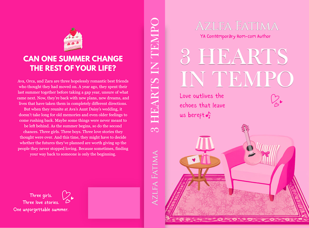
I don't want every illustrated romance cover to disappear. I don't even think they should. There are books where the style is absolutely perfect. But I want individuality. Maybe a central part of the story. Maybe an item. Maybe a location. Maybe a colour scheme that actually has something to do with the characters. Maybe something that doesn't even make sense until you finish the book. Just stop using the same drawings, but changing the hair and clothes on the characters every time. Because I don't want to look at a cover and immediately know exactly what the entire marketing team thinks I'm supposed to feel. I want to be curious. I want to wonder. I want the cover to give me a tiny glimpse into the story without giving me the whole thing. And honestly, I think that is what makes a great cover.
Conclusion
Once again, as a lover of these books myself, I don't have a problem with some of these covers. It just gets ridiculous when I see shelves full of them and can't tell the difference. I think we should move away from the completely identical covers and add some individuality to them. Because romance itself is not identical. The characters aren't identical. The stories aren't identical. The relationships aren't identical. So why should the covers be? There are millions of romance stories out there. Yes, some of them have the same tropes. Yes, some of them have fake dating. Some have enemies to lovers. Some have childhood friends. Some have second chances. Some have a girl who hates a boy until she suddenly realises she has been in love with him for 300 pages. And I love all of that. Because the trope isn't the entire story. The details are. The little moments are. The characters are. The way one person looks at another when they think nobody is watching. The stupid inside jokes. The dates that are definitely not dates. The fight that wasn't really about what they were fighting about. The confession. The heartbreak. The happy ending. That's the part I want the cover to make me curious about. Not just, “Here are two cartoon people. They are going to kiss.” Because I already know that. And I think the same thing applies to books as a whole. A cover is the first thing that invites us in, but it shouldn't be the thing we remember most. I would rather have a book with an ugly cover that breaks my heart than a gorgeous book that I forget five minutes after finishing. So yes, I will still judge books by their covers. I will still pick up the prettiest edition. I will still complain when a cover makes no sense. I will still get excited when an illustrated cover perfectly matches the story. And I will absolutely still stare at a bookshelf and wonder why every single romance looks like it was invited to the same wedding. But maybe that's okay. Because covers change. Trends change. Our tastes change. And one day, we'll probably look back at this whole era of bright cartoon couples and think it was just another weird little chapter in book-cover history. Until then, though, publishers, designers, authors, please give us something different. Maybe a central part of the story. Maybe an item. Maybe something completely unexpected. Just give me a reason to stop walking past the shelf. Because I don't want to pick up a book and think, “Wait... haven't I already seen this cover?” I want to look at a cover and think: “Oh. This one is different.” And then I want to open it. Because at the end of the day, the cover is only the beginning. The story is what makes us stay.